Ordinary Objects as Things of Beauty
“Good design” means different things to different people. For the Navajo tribes of the American West, this meant geometric patterns and complex weaving. For the kings of 19th-century France, good design meant epic palaces with elaborate and ornate decorations. We see these legacies play out in everyday life—domes and columns in government buildings, for example. But the Japanese approach the pursuit of good design on a whole different level, outlining five basic principles that should be considered when creating or designing an object or a space.
Why does that matter for a non-designer? Because these principles take home décor to the next level. Here’s why.
The Basics
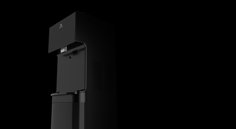
Bottom line when it comes to Japanese design? Simplicity is king. The essential idea is that ordinary objects (or spaces) can be extraordinary when approached thoughtfully and with intention. That’s to say, the most “regular” of things can, and should, be things of beauty. That coffeemaker you turn on every morning? It doesn’t have to be just a vessel for your daily caffeine. That water cooler taking up space on your counter? Yeah. It should be something you not only enjoy using, but looking at too. That’s to say, why can’t a water cooler be useful AND beautiful? Of the five ideas, there are three that make the most sense for non-designers to think about. These are:
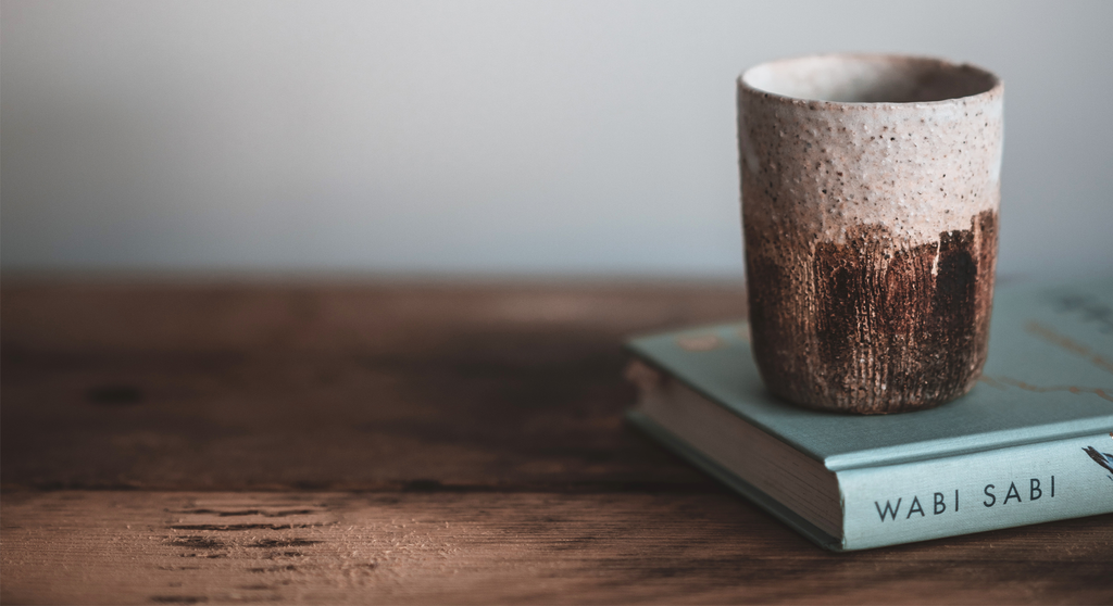
Wabi-sabi. The principle of wabi-sabi refers to the ability to consider things that are imperfect or incomplete as works of art in their incompletion. A style of Japanese art known as Kintsugi incorporates broken shards of pottery, for example, and “mends” them with precious metal and custom lacquer.
What we learn from it: Sometimes we find the most beauty in that which has been broken or discarded. Thrift-store shopping, anyone?
Miyabi. Directly translated, miyabi means “refinement” or “elegance.” The principle need not be applied to something traditionally considered elegant to earn the descriptor: Miyabi also refers to a brand of knives—developed in Seiki, Japan 800 years ago—used for traditional Japanese cooking.
What we learn from it: A practical household object can absolutely be a thing of beauty. Why have something in your home you don’t like looking at?
Shibui. There’s a difference between something that screams “look at me” and something that elicits an entirely other response—even if both are breathtakingly beautiful. The principle of shibui refers to something that is simplistically and subtly well-designed.
What we learn from it: Beauty doesn’t have to be complicated. This is basically the KISS theory from high school science class.
How the Principles Resonate
Kenya Hara is a Japanese art director currently at the helm of fast-growing Muji, a company known for its simplistic and inspiring design, like Avalon. Hara made a name for himself rethinking the design of regular, everyday objects. According to dezeen Magazine, Hara created an exhibition in 2000 known as Redesign, in which he asked artists to reimagine household products. He recalls one such contribution that helped to shift his perspective (from dezeen):
Karou Mende created matches by using normal twigs. Natural twigs fall down on the ground and just become normal soil, this makes the natural matches look very fantastic. It reminds man, as a human being, of the importance of the real fire. The lighter and electric power don't remind humankind of the importance of the power of the fire like the twig matches do.
That’s to say: When we begin to look at—and for—well-designed versions of everyday objects, we may not only be adding beauty to our home decor, but creating subtle paradigm shifts in the way we think about our possessions as well.
We like to think that Avalon products embody this kind of shift—and give credence to the Japanese principles of design. Have a recommendation of how our products can better integrate into the design of your home? Leave them in our Instagram comments.


